Feromon
Brand Identity
Packaging Design
Commerce

Feromon is a premium scent brand that translates the sensory atmosphere of Copenhagen into a minimalist, design-led candle collection. The project explores how graphic restraint, material sensitivity, and narrative branding can elevate something familiar into an experiential object.
Year
2025
Services
Art Direction, Graphic design, 3D Render

Problem
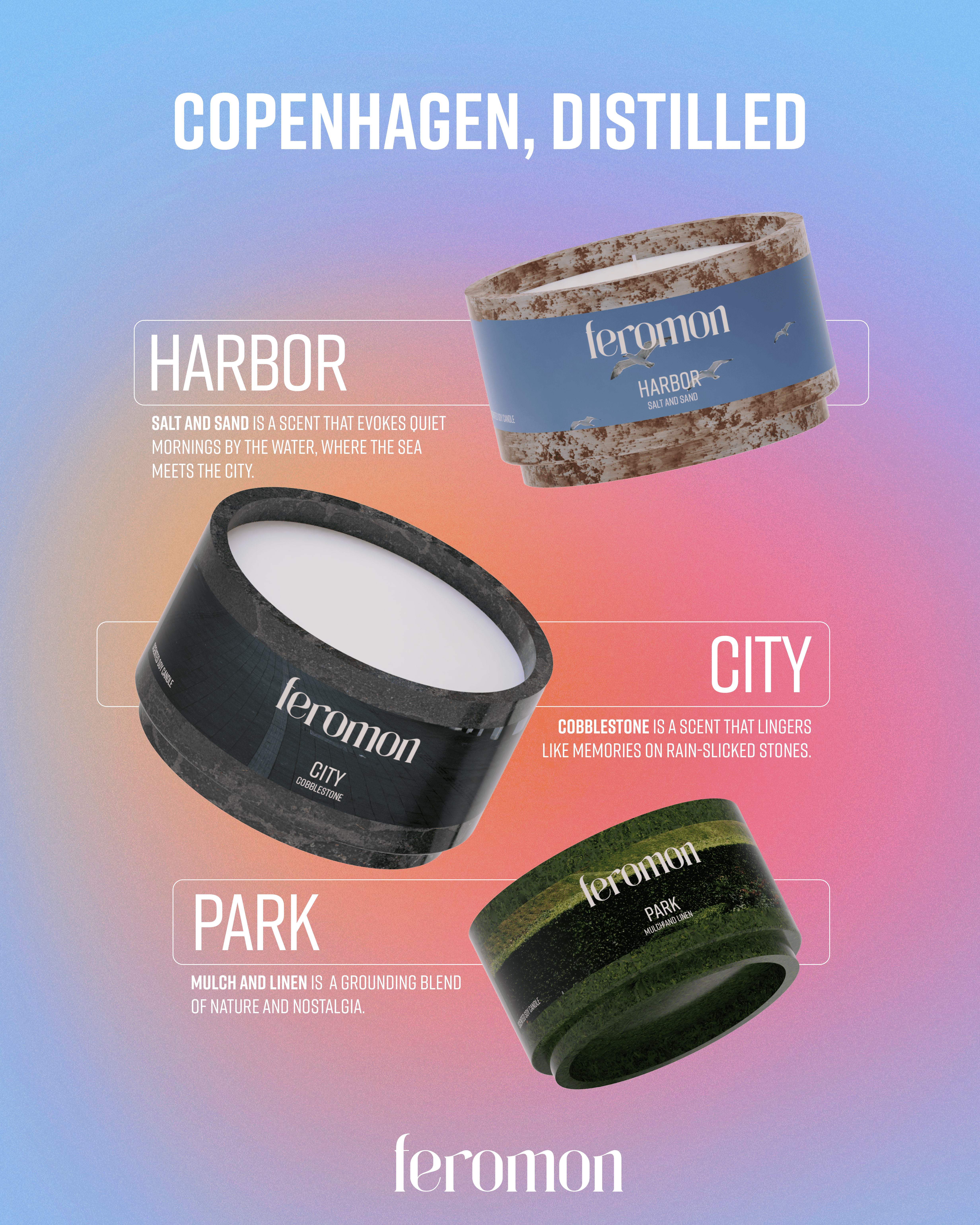
Rather than depicting landmarks, Feromon focuses on sensory memory. The brand distills subtle, everyday elements of the city. This includes harbor salt, cobblestone texture, park air, linen in sunlight; into scent, color, and form. The result is a quiet, design-led candle line that feels lived-in rather than performative.
Ideation
Early ideation focused on identifying materials, environments, and emotional cues tied to Copenhagen:
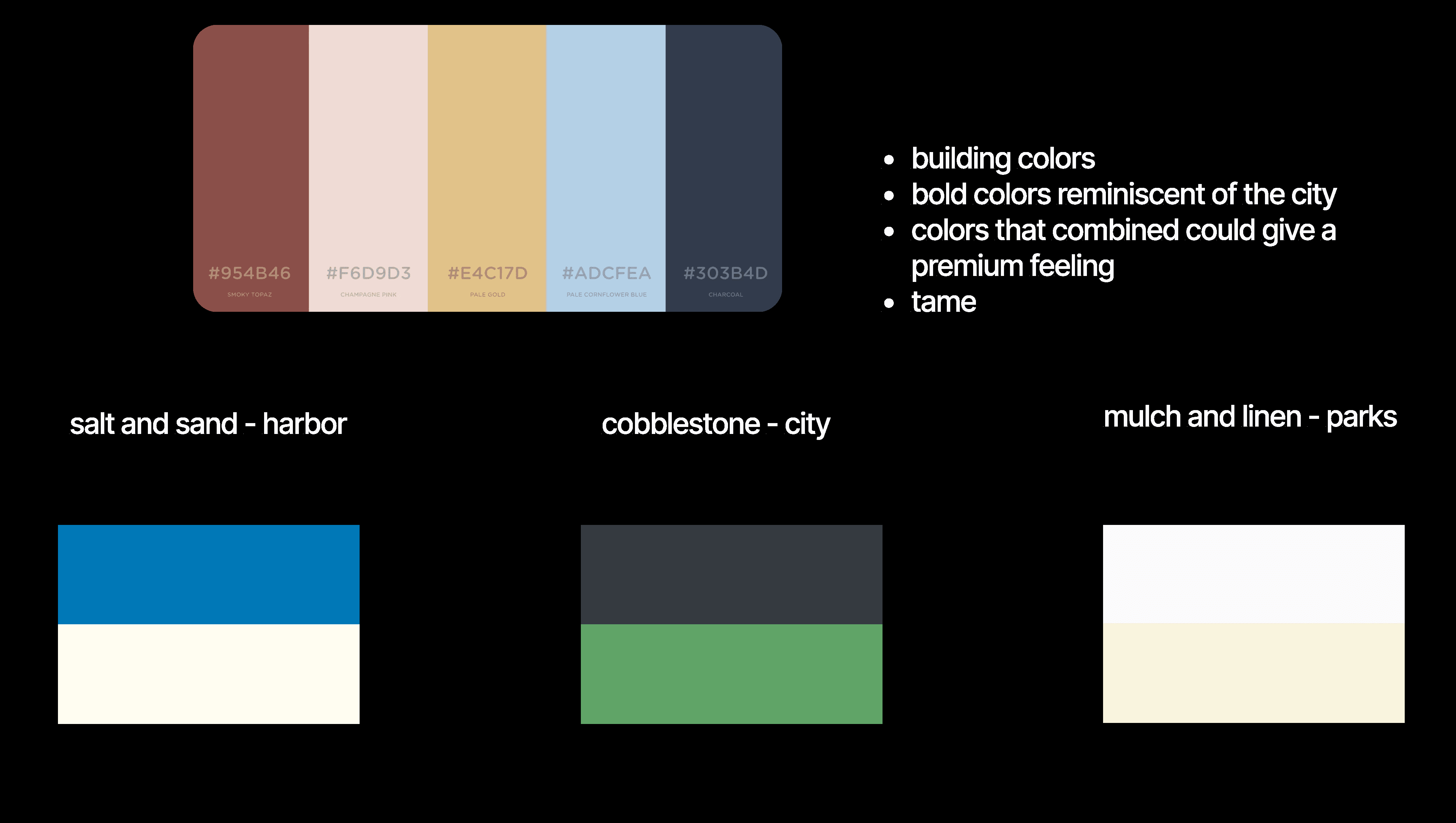
Salt and sand from the harbor
Cobblestone textures from the city
Mulch and linen from parks and residential areas
Bold yet controlled color combinations that still felt premium
The challenge was balancing richness and restraint while keeping the system calm without becoming bland.

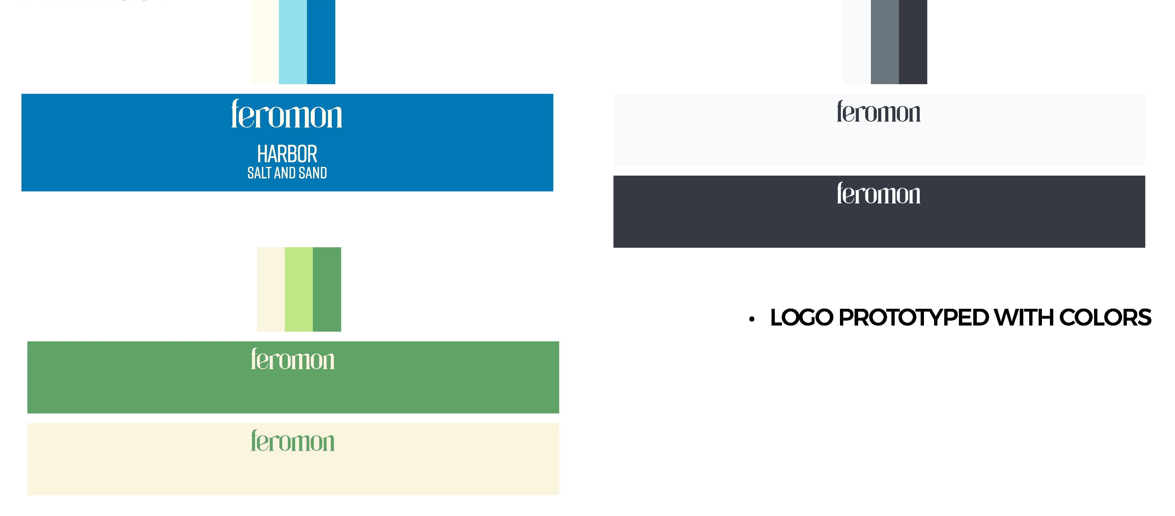
Color System
A muted, architectural palette drawn from Copenhagen’s natural and built environment. Colors were tested for cohesion, calm, and premium balance.
Logo Exploration
Multiple directions were explored—from culturally specific to overly generic—before arriving at a solution that felt distinctive and accessible.

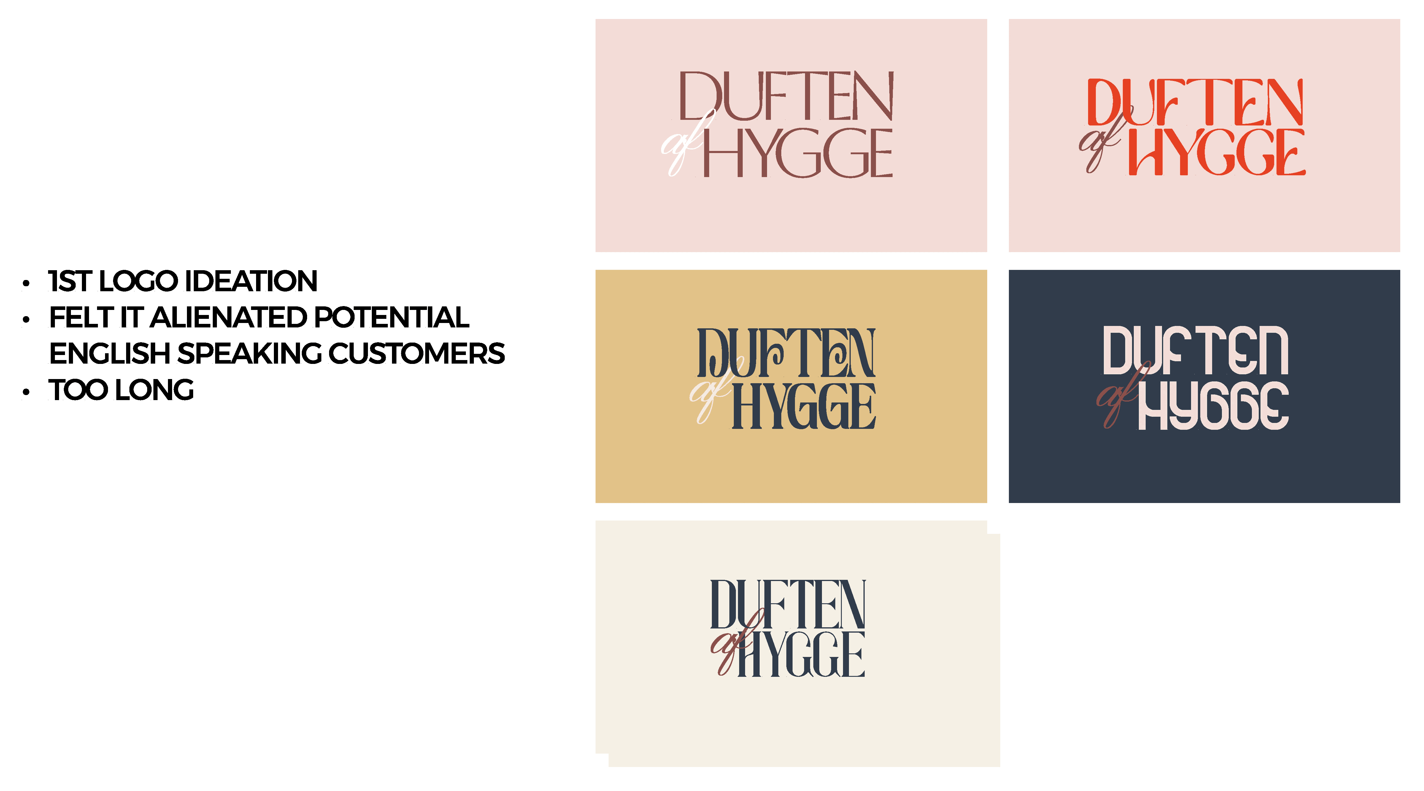

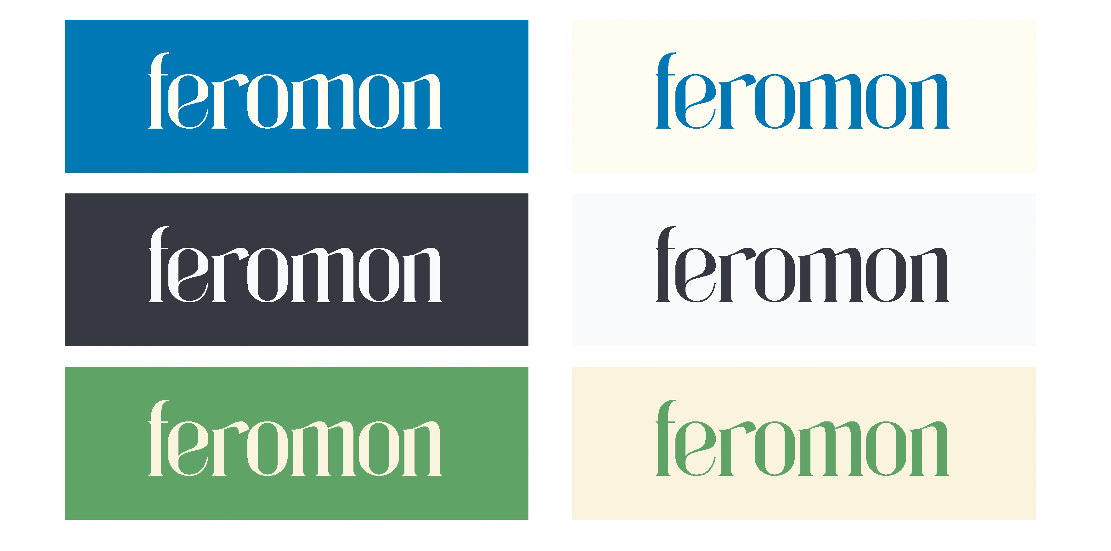
Final Logo: Feromon
The final word mark uses Danish spelling while remaining immediately legible to English speakers. The name feels intimate, biological, and sensory further aligning with the product’s focus on scent and atmosphere. Typographic restraint reinforces a premium, gender-neutral identity.

Label Design
Minimal typography and subtle variation differentiate each scent while maintaining a cohesive system. Labels emphasize material presence over decoration.


Packaging System
Outer packaging mirrors the candle labels, creating consistency across all touchpoints and a calm unboxing experience.

Candle Container
Designed for longevity and reuse.
Ceramic or thick tin materials
Stackable form
Repurposable as a catchall, ashtray, or planter
Sustainability is embedded through function rather than messaging.


Outcome
A resolved, market-ready candle line that demonstrates how graphic restraint and material sensitivity can translate place into experience.
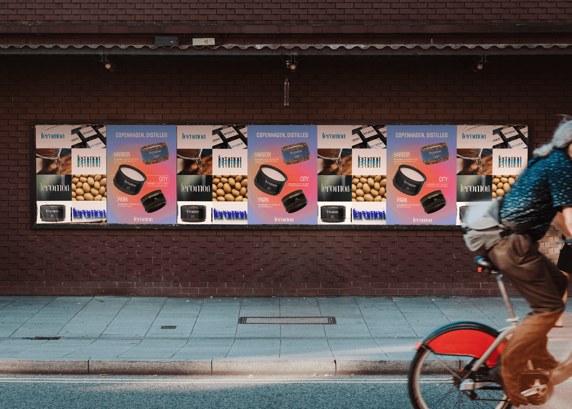
Marketing
Posters that fit within the real world to show how it might come to life.