STAMPS
Illustrator
Typesetting
Render

The STAMPS School of Art & Design’s existing wayfinding system lacked cohesion, clarity, and a strong institutional identity. Signage elements felt disconnected from one another, making navigation difficult and diminishing the school’s visual presence. This project reimagines STAMPS’ wayfinding as a unified, recognizable system that supports intuitive navigation while reinforcing the school’s brand.
Year
2025
Services
Graphic Design, Creative direction, Mockups

The Problem
The current wayfinding system was disembodied; signage styles varied, visual hierarchy was inconsistent, and branding was not clearly expressed across spaces. As a result:
Navigation felt fragmented and unintuitive
Key spaces lacked visual emphasis
The STAMPS identity was not reinforced within the building
Design Intent and Core Strategy
The goal was to create a unified wayfinding system that guides movement intuitively while feeling distinctly STAMPS.
The approach centered on standardizing hierarchy, spacing, and visual language so each element works independently and as part of a larger system.
Color System and Typography
Colors were pulled directly from the STAMPS website to ensure continuity. A bright orange accent was introduced to add energy, increase visibility, and bring a sense of newness to the environment.
Type choices prioritize readability from a distance while maintaining a modern, institutional tone. Scale and weight establish clear information hierarchy.


Iconography
A simplified icon system supports quick recognition and accessibility, helping users navigate without relying solely on text.

Interior Introductory Signage
Introductory signage establishes identity and immediately situates visitors within the building.

Directional Signage
Directional signs use consistent hierarchy and spacing to lead users through corridors and intersections with minimal friction.


Utility Signage
Restrooms, studios, and support spaces are labeled with the same visual language to maintain continuity across all touchpoints.

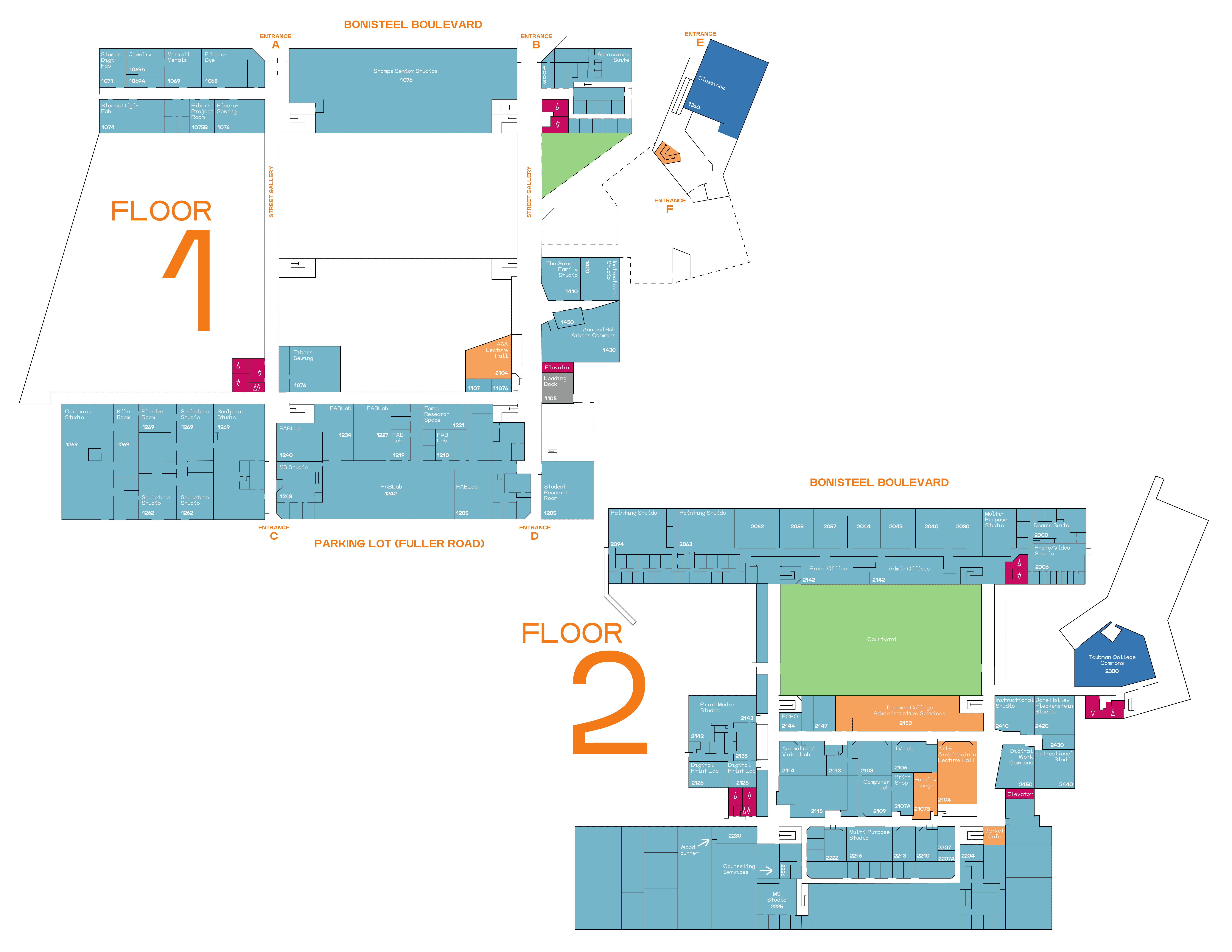
Building Map
A simplified building map provides a clear overview of the layout and key destinations, supporting both first-time and returning visitors.
Donor Wall
The donor wall is treated as part of the wayfinding ecosystem, blending acknowledgment with spatial clarity rather than existing as a separate visual moment.

The Solution
The redesigned system creates a clearer, more intuitive experience while strengthening STAMPS’ presence as a creative institution.


